
Some aspects of business are complex, but sometimes, they are still things we want our customers to have some sense of. How your business is structured, what your process is, how you compare to others…
Anything that might have required loads of jargon and 1000’s of words might just need a simple and engaging infographic.
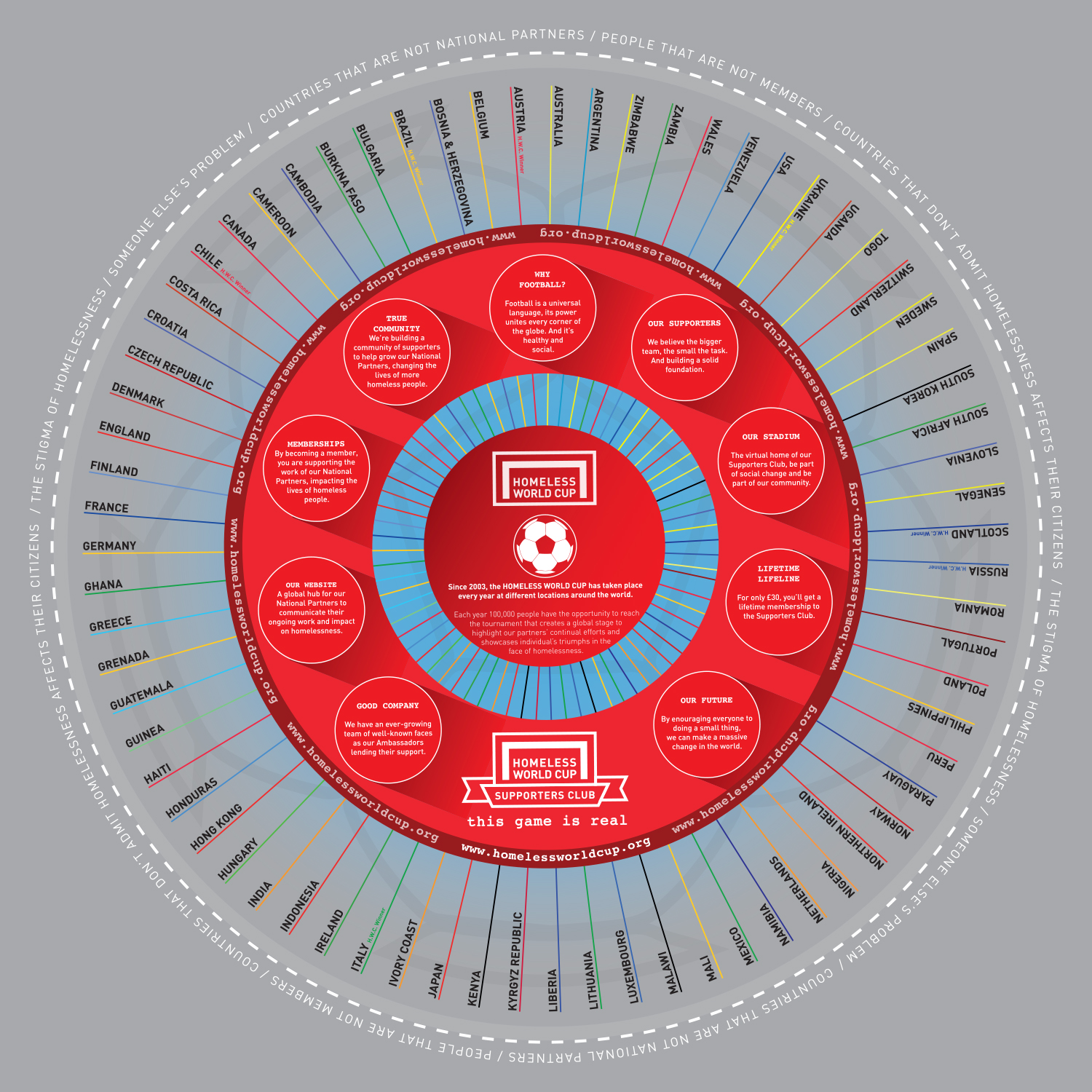
Homeless World Cup: Activity around the globe, a network of media attention, activism, a team of ambassadors, memberships and a huge annual tournament required an organisational infographic. The objective was to show how all these elements are connected, and share one central aim – using the universal power of football to highlight and positively impact those affected by homelessness.
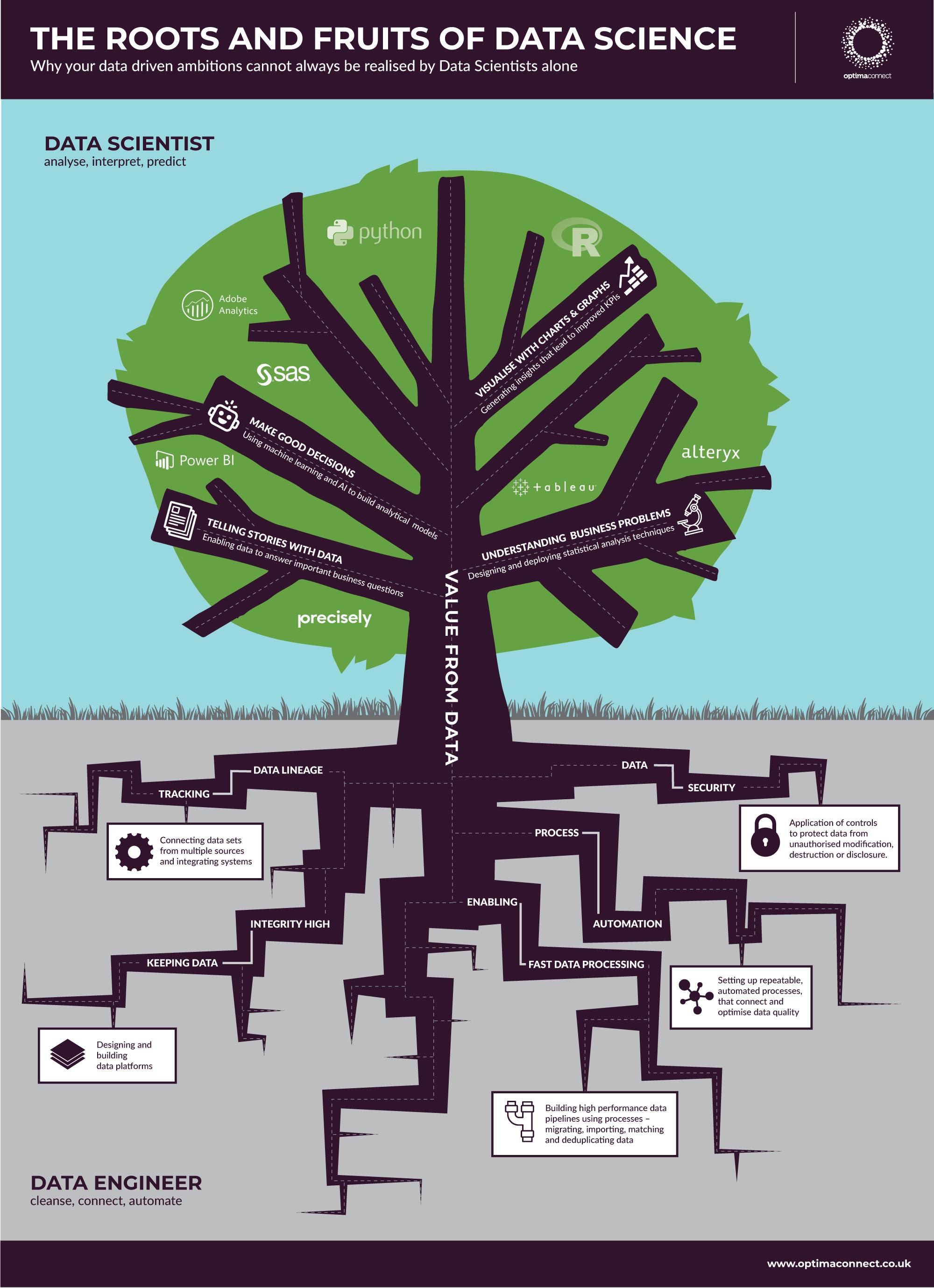
Optima Connect: Technology, by its nature, can become extremely complex. Whilst the details aren’t necessarily important to understand, it’s often a good idea to try and simply convey the basics. Data science and data engineering are two fundamental parts of what Optima Connect offers, so this infographic was commissioned to help prospective clients understand how these two related disciplines function together.
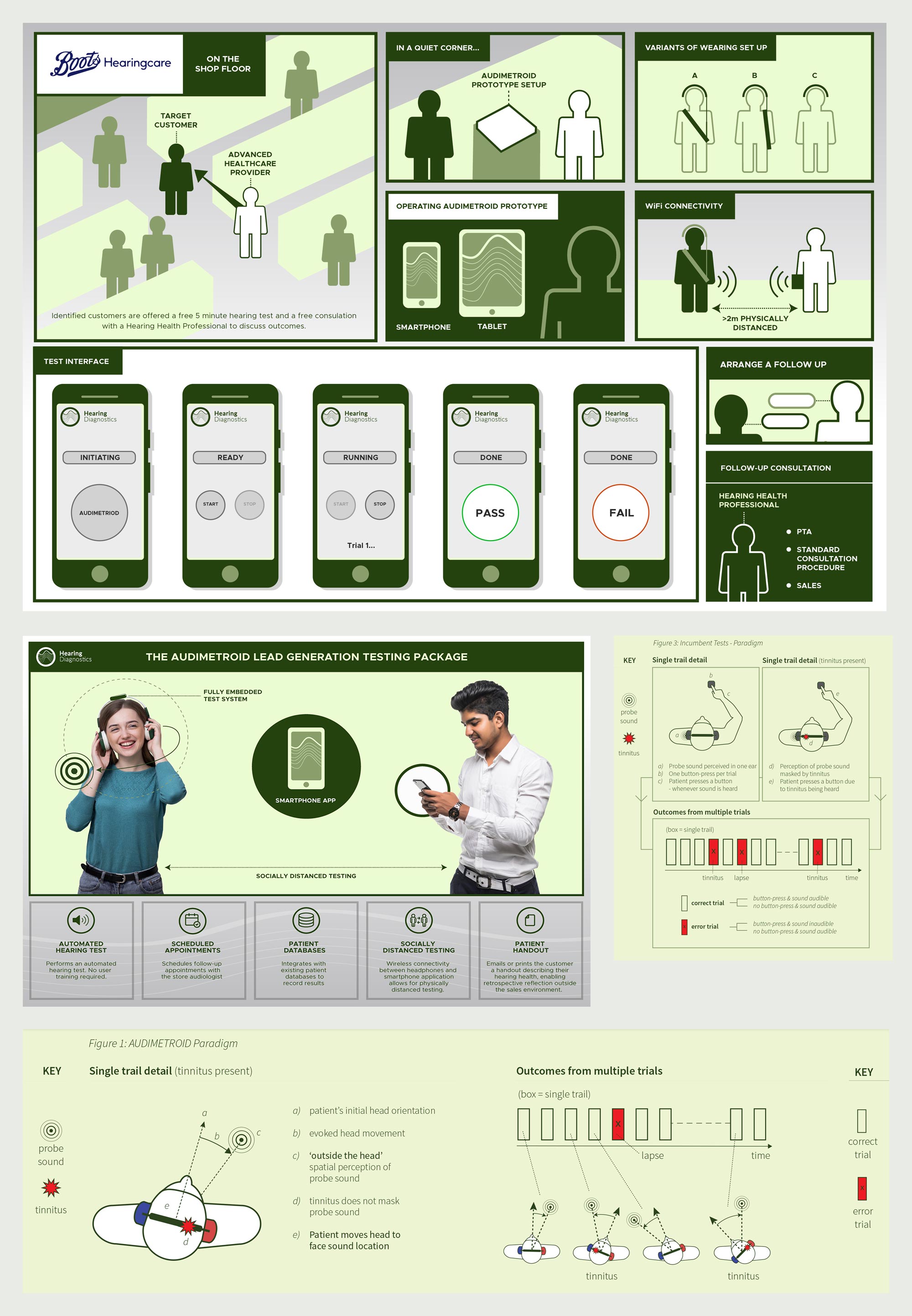
Hearing Diagnostics: This medical technology business required a full suite of infographics for their innovative spatial hearing test platform. Clear and straightforward information for non-medical staff, whilst presenting highly specialised scientific data for health care professionals elsewhere, in their marketing and sales material.
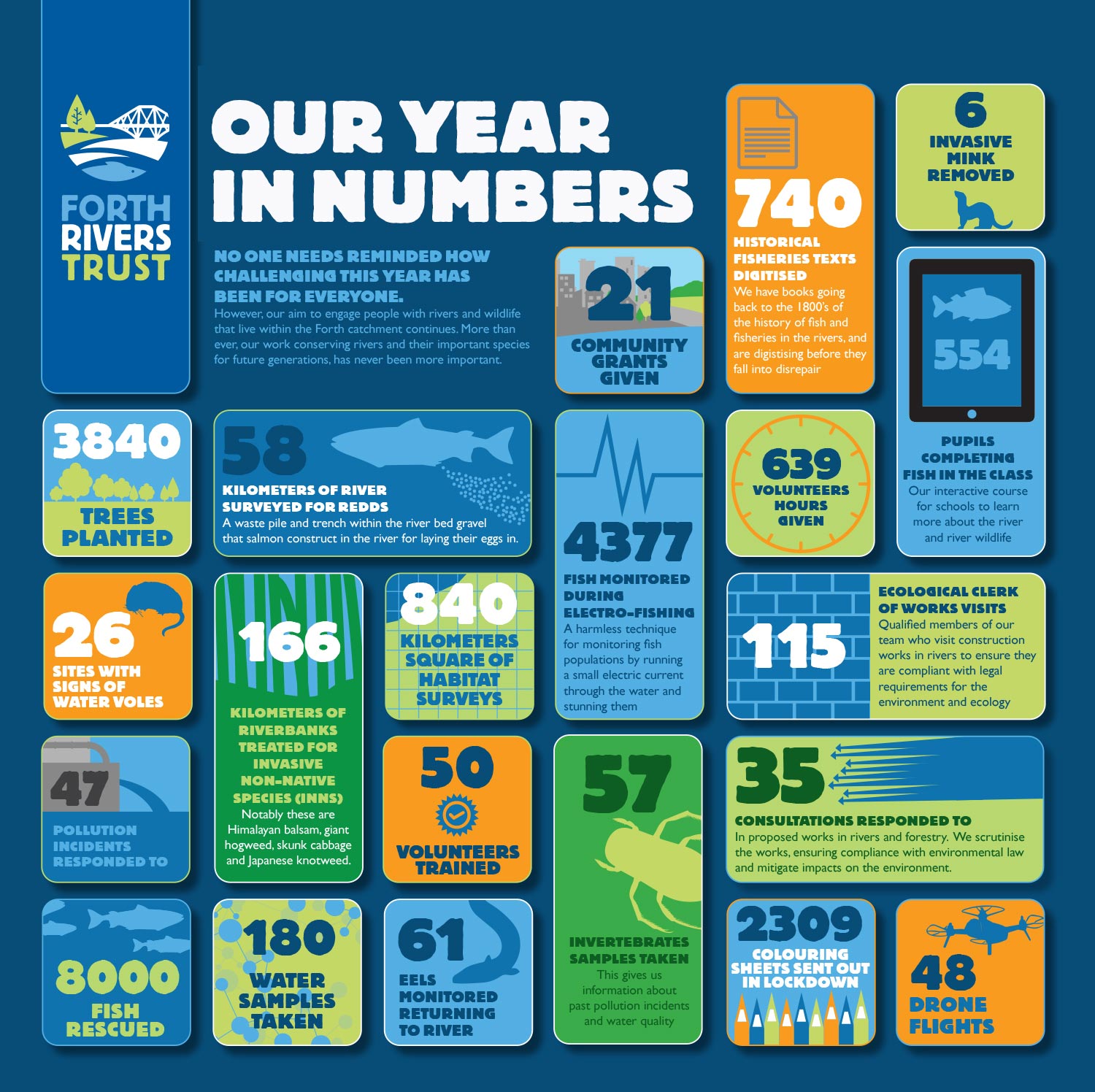
Forth Rivers Trust: This campaign spotlighted the organisation’s year in statistics. One aim here was to show how productive and wide-ranging the scope was for both the organisation and its supporters.
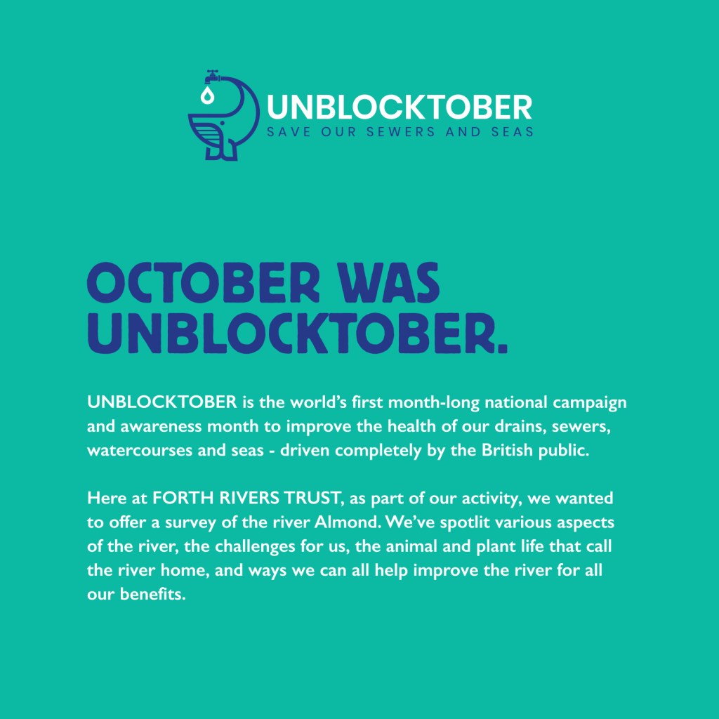
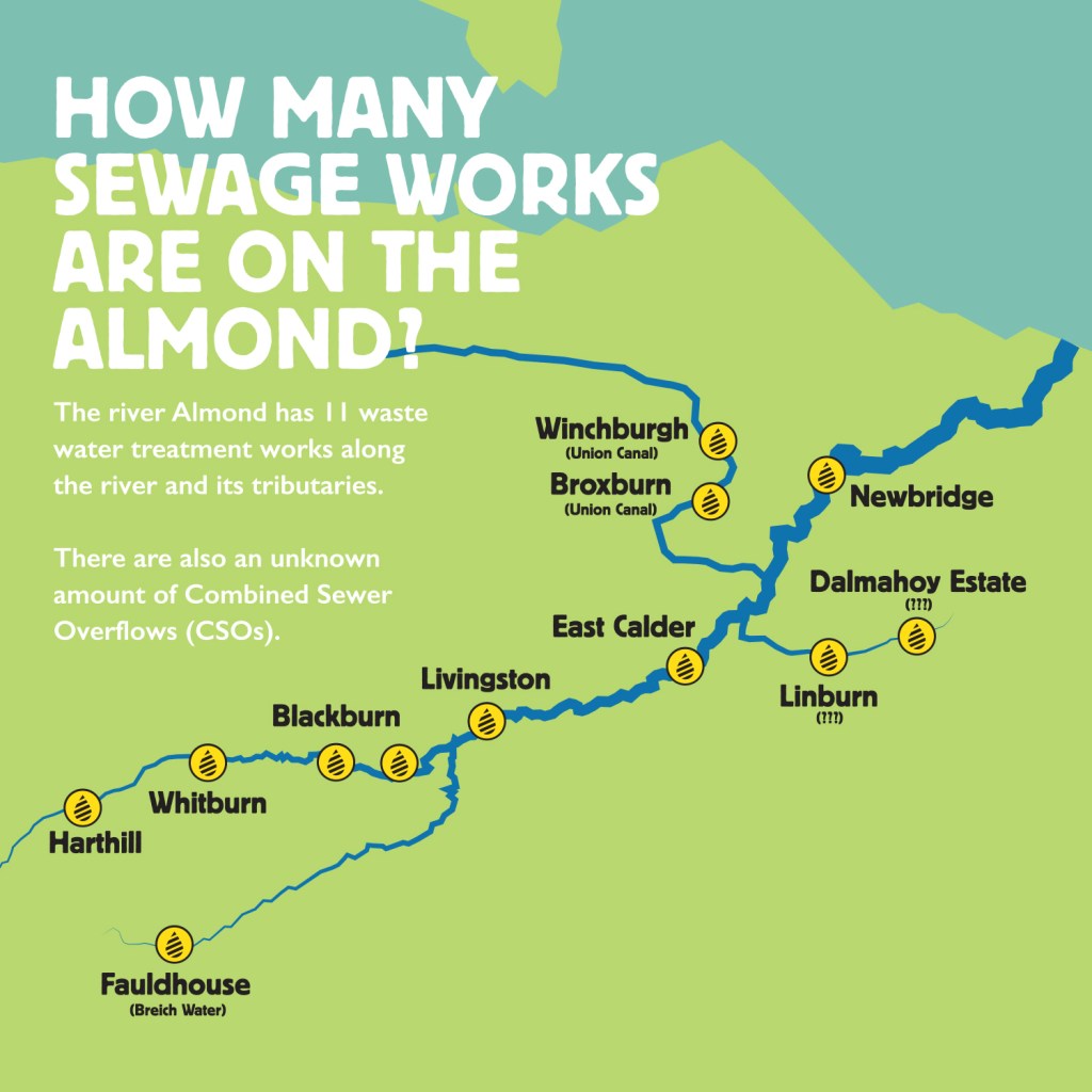
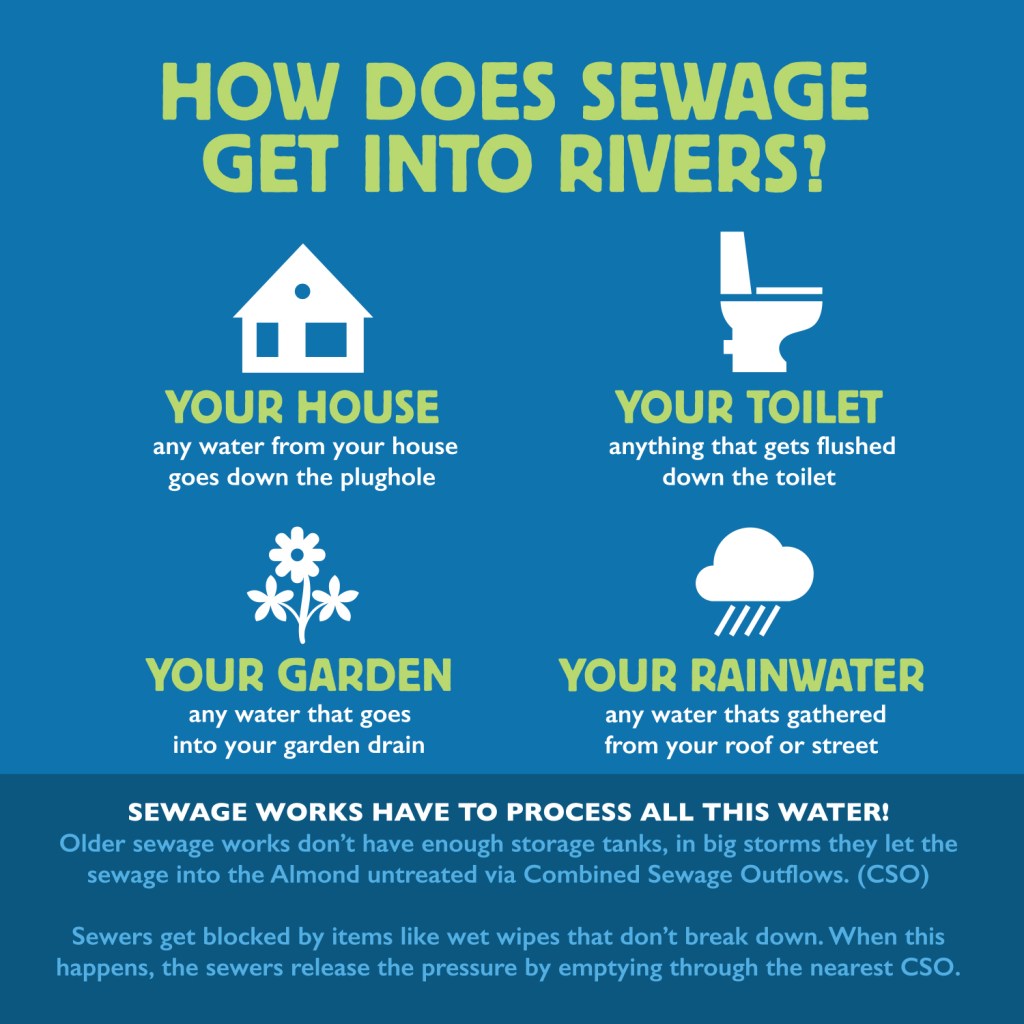
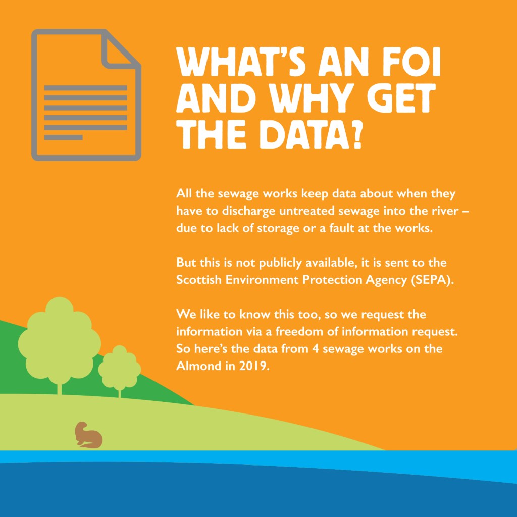
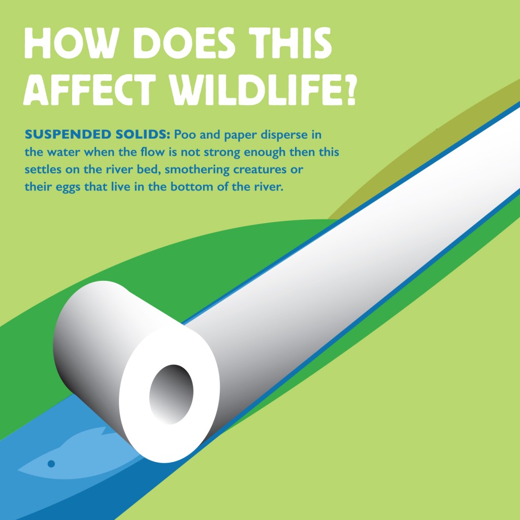
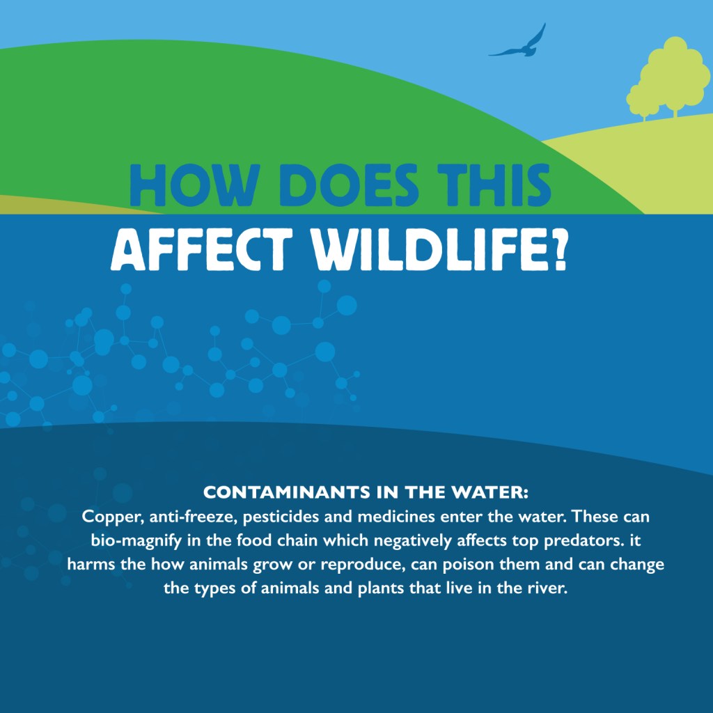
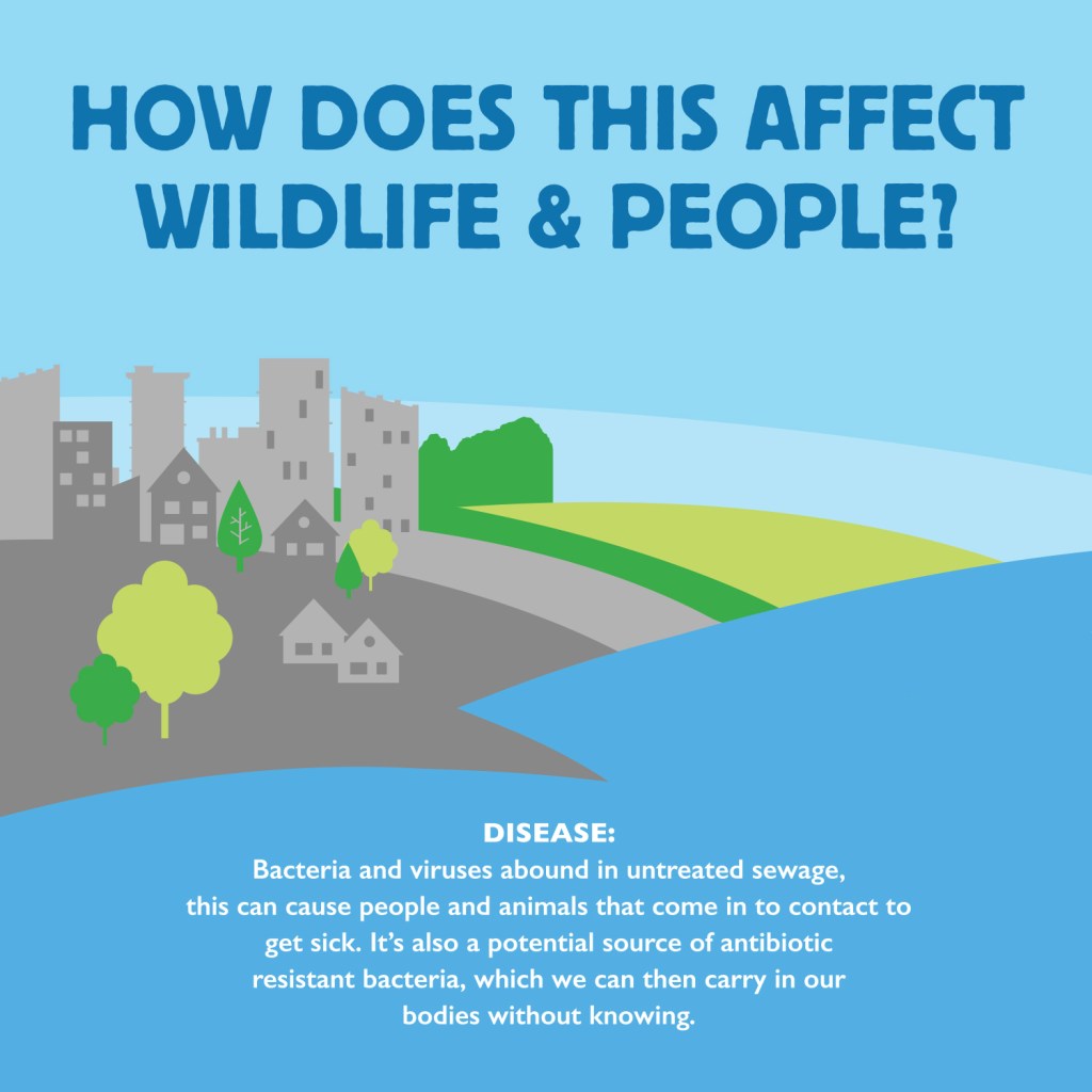
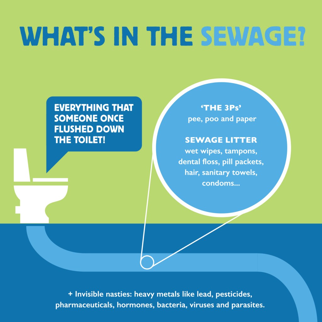
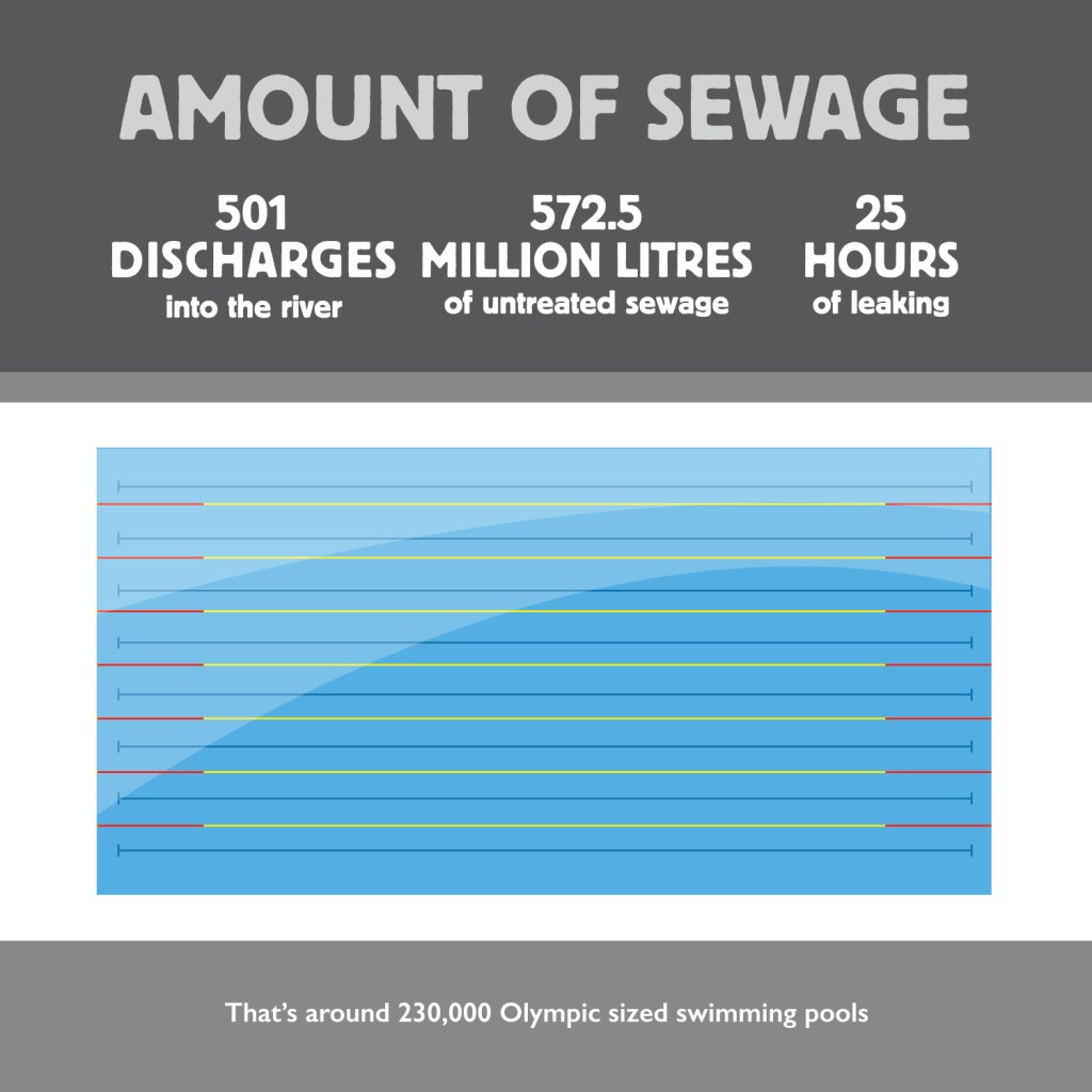
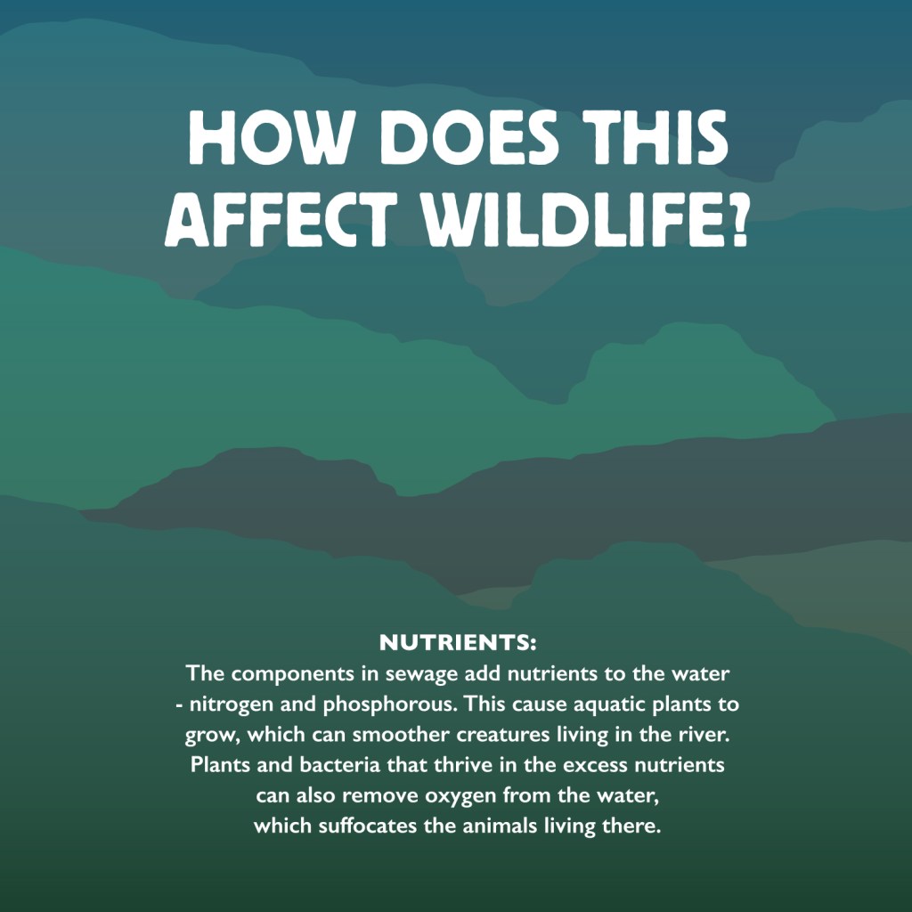
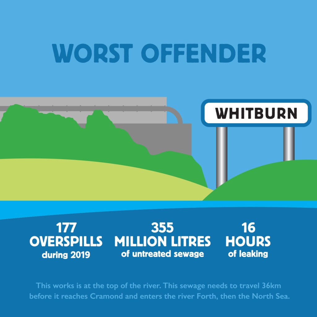
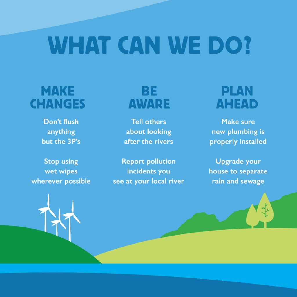
Forth Rivers Trust: October became the basis of Unblocktober. A campaign that provided a graphic and statistical overview of the River Almond, and how sewage impacts the river, wildlife and communities that live on or near the river.
